bobby vomit's blawg
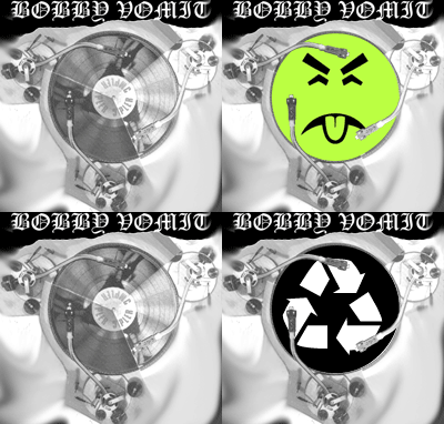
bobby vomit redesign #1
posted by stAllio!like the new look? it's just a color variation on the original design. really fucking creative, i know.
leave your feedback/suggestions here.
9 Comments:
evil dark ,,hahaha aa i like back ground black does glow your eye balls out or hurt them?
i've improved on the layout of the comments section, too. before it looked rather plain.
i'm still unsure about some of the color choices.
okay, now i'm pretty pleased with the colors.
it could really use a new picture for the top right, though. the current one is good, but it's too short. we need a taller one. maybe even an animated one.
wre photos go?
seriously the janek remix pitcure one and 2 are not pooping up and the link does not work i posted this o see and tampa phototo is up>??i can just repost
seriously, the pictures are there. if you can't see them the problem is likely on your end. for one thing, they're big files and they take a long time to load.
there on my home computer way cool ophoto on left holy crap only thing missing is mutiplyied tonearms
the rules of perspective are a harsh mistress... in order to paste in another tonearm and have it look realistic, the picture would have to have been taken from a very particular angle. i've been scouring google and i can't find any images of tonearms that would work. getting a good one might require photographing it ourselves, and i don't feel like messing with that right now.


